Making-of Blobby the Level Shrinker
Hello everyone !
Here's my adventure of making Blobby the Level Shrinker for the GMTK Game Jam 2019.
============= The idea =============
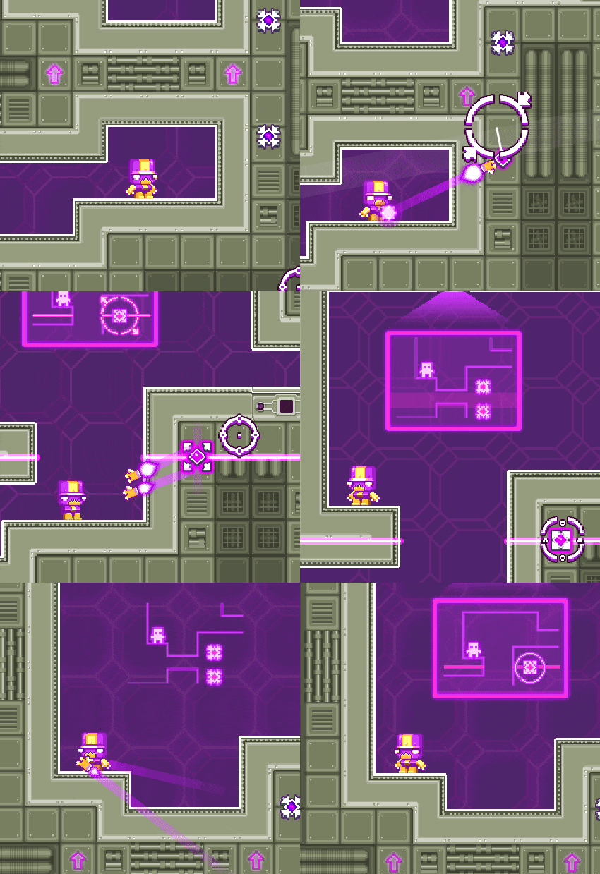
So, when I first heard of the theme, I knew right away that I wanted to do a game where everything is happening on the same screen. A lot of game that does that already exist, from almost every old game like "Pac-man" or "Space invaders", to more recent and innovative game, like "This is The Only Level" or "Tiny Castle". But I decided ultimately to use that idea from "Faultline" and adapt it for the "One screen" gimmick. The idea is to have the level limited on one screen, but with no camera, so you have to use mechanisms that are able to shrink the level so you can explore what is offscreen.
Nitrome's Faultline
At this point, I had the general idea, and I would figure the details while implementing (and while eating, and while sleeping). I never work with fully formed ideas because some ideas are really hard to implement, so I always change things during development and ideas are always developing on their own while doing something else. Okay, now it's time to get in the code !
============= Technical aspect =============
I'll try to be as non-developer friendly as possible here. First of all, I'm using Monogame with C# with Visual Studio. Those are technologies that I know well enough to not struggle that much with them.
At the beginning, I had to implement my idea, but, since it's a complicated one, I had to simplify everything else, so no physics, no platforming, very simple collisions, no IA, no enemies... Only a 2D level constituted of cells that can be shrunk, cells allows me to be able to code faster since it's easier to handle with the shrink mechanic.
Ok, so a few hours later I had my walls, my floor, my character that could move. Oh, yeah, I decided to have my character move like you move on ice (Sliding until you hit a wall, that's very common in video games.), I thought it was more puzzle-friendly because you limit the player's possible actions.
Now, for the main mechanic, after another few hours of trying to implement this so it's working properly, I had this solution. Every cell has an "invisible index" that is incremented when shrank. Each cell that has an index superior to zero were not displayed. Looks how it works with a simple gif, that uses colors instead of the invisibility. The cell's color represents the "invisible index".
Yellow : Invisible index = 1
Orange : Invisible index = 2
Red : Invisible index = 3
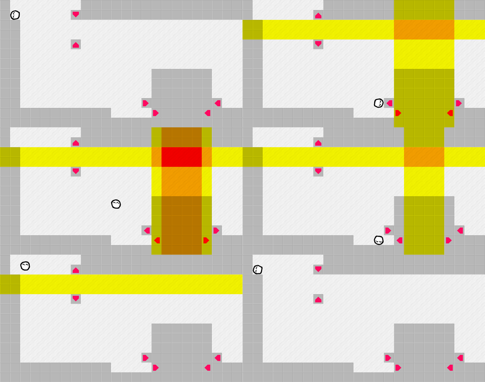
Some debug view, before the levels actually shrinked. (Sorry I have not kept the old graphics...)
So all I had to do from that is to display only cells that are visible, I managed to do that with two lists of cells. One with every cell, to be able to recover them if the level is going back to its original state. And one with only the visible cells, that is used to display the level and for the player so it cannot reach invisible cells.
Once I had that, the code was mostly done, apart from some bugs that I have corrected before the end of the game jam. Next step, the levels!
============= Level design =============
Okay, so here's another complex challenge. How to make levels that are interesting to play? I've set myself some rules for the levels I wanted to make:
1 : The player must not be stuck. Because it's frustrating otherwise.
2 : The levels can only extend to the right and bottom part of the screen. For some technical reasons.
3 : The shrinker cell always goes with its opposite cell. For more technical reasons. (See the screenshot below, this situation won't work in the game)
4 : The player cannot hit a shrinker from inside, otherwise Blobby would be stuck and the game would crash.
5 : The level must be cool. Duh.

This is not possible.
So here we go. At the beginning I wanted to have only one level that extended much further, but I realized that I needed to explain things to the player a bit more. So here I am, making the level 4. It was painful, everytime I extended the level I had to test it for several minutes to see if it had broken the beginning of the level. Every cell that I added had the potential to permanently block the player. The level 4 alone took me about 6 hours of my time to build. Here's what it looks like on Tiled, the tool I've used to build level.
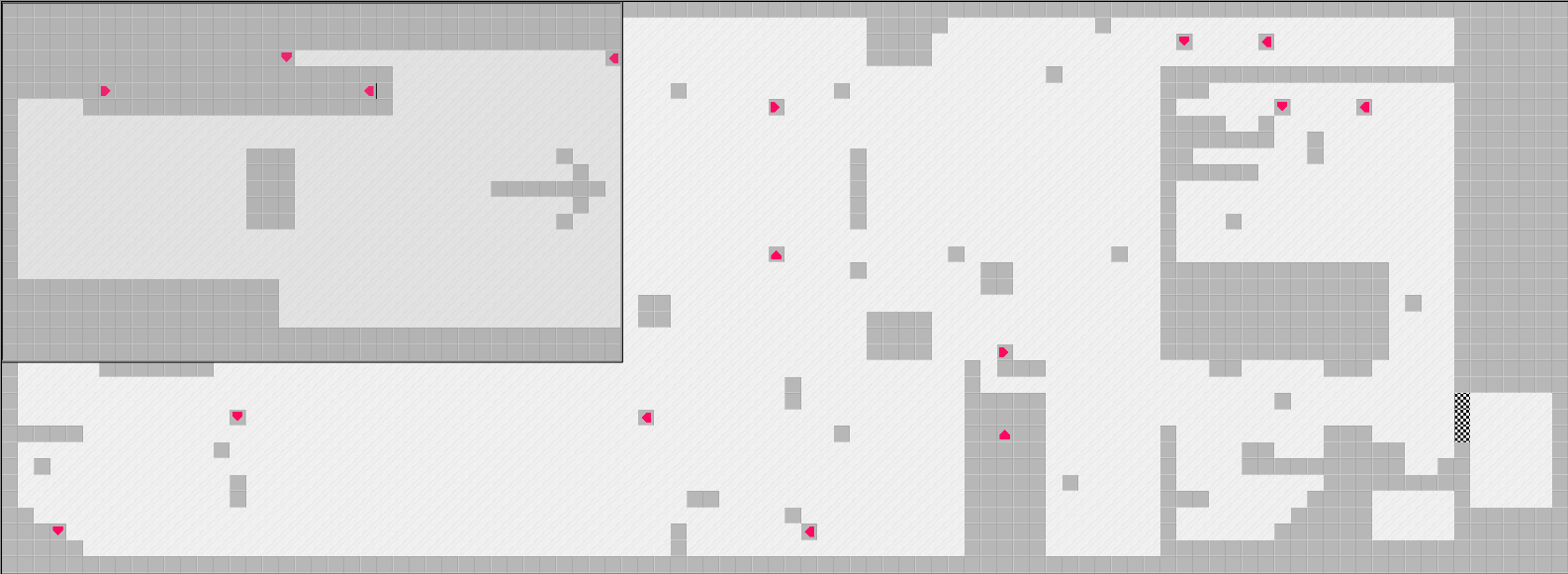
Look at that level ! It's huge when everything is expanded. The rectangle represents the screen size.
After that, I've made level 1 and 2 quite easily. And level 3 took me a little more time to make it like a real puzzle, but it was okay.
All these level were modified a little after I've made my brother play the game, playtesting is really important! The level 3, at the start, was insanely easy because of its original layout. Ok, now let's talk graphisms.
============= Graphics =============
At the beginning, everything was square and textured with gimp default textures. It was cold and not charming. So I changed the player to be round with eyes and more importantly I've animated it using JuiceFx. This helped me give life to the character, and some other sprites in the game, since I'm not a graphist, I'm more of a code kind guy.
Oh, and since its a little blob, I took time to make Blobby squish when hurting a wall. And it was a time well spend I think :)
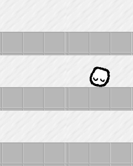
Splat !
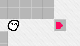
Oh, also, the color used for the shrinker devices is the same color used for the GMTK game jam logo.

============= Polishing =============
- I know polishing is important, so here's the things that I did during the last hours of the jam:
- Adding a music, I've used Jamie by lifeasaghost. Thanks for making that music, you awesome stranger!
- Adding sounds effects! Again, I've been searching for things here . Very useful website if you are unable to record something.
- Making the player's movement smooth and fast. I had some trouble with my player's movement that was not responding perfectly in last year's game jam. So this one had to be good!
- Finding a title. This exactly took me 15 seconds. Eh. I should have taken more time to find something better, maybe ?
- Making a main title screen. This one is pretty simple so it did not took me a lot of time.
- Screenshake! Yeah!
- Adding texts! The dialogs are actually one of the last things I added in the game! You should see the code, it's really bad, but it works.
And so this is it. Blobby the Level Shrinker was born!
============= Sooooo =============
I'm pretty happy of what I did! This time I had a lot of time to focus on level design and this was really fun! I'm having a blast playing other entries from the game jam and reading your comments are really making me feel good so thank you :)
I hope this was nice to read, I have not covered absolutely everything, but it's okay I guess. ;)
Remember you can play the game here : https://itch.io/jam/gmtk-2019/rate/461864
Files
Get Blobby the Level Shrinker
Blobby the Level Shrinker
Only one screen. The exit seems unreachable. Maybe you can shrink the fabric of reality ?
| Status | Released |
| Author | Lucas Delvallet |
| Genre | Puzzle |
| Tags | 2D, blob, Game Maker's Toolkit Jam, Short |

Comments
Log in with itch.io to leave a comment.
Great post!